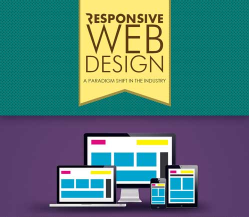
 Comscore suggests there will be 1.9 Billion mobile Internet users by 2015. So what? Well, with the popularity of mobile devices, your business’s website better be viewable on different screen sizes AND have the same marketing impact. Mobile responsive website design is the most affordable and impactful way to execute your web strategy.
What is Mobile Responsive Website Design?
A website that is designed to display the content and/or layout of the site automatically, adjusting to the screen size it is presented on (i.e. “responds” to the device). The mobile device market is ever changing; at this point (debatable), the four typical types of screens that responsive sites adjust to are: desktop, laptop, tablet, and smartphone.
Although it is becoming more mainstream now, I’ve been talking about mobile responsive website design for about 18 months. We live in an instantaneous society, so consumers want information to help them make purchasing decisions; and they want it now. According to Google, 84% of people search online before they make a buying decision. With the increased use of mobile devices and a consumer dependency of searching online before purchasing… this is as simple as 1+1.
If you are still thinking about it, mobile responsive website design has to become a priority for your business’s web strategy if your business wants to capitalize early on a trend that IS NOT going anywhere.
Benefits of Mobile Responsive Website Design
There will be a growing list of benefits as the technology evolves and usage increases. At this point in time, there are three key benefits of mobile responsive website design that I believe are important to share:
Easy Management
All you need to do is manage one content management system and all of your changes will be reflected across all the types of screens. This is very efficient for businesses that have limited resources and budget.
Growth Opportunities
Take advantage of consumer behaviour trends. Consumers ARE searching for your service or product (3 billion online searches per day), get found when THEY want to find you.
User Experience
If you have a mobile device right now, go to www.thebay.com. (At the time of this post), try to navigate on this website and find “mens shoes”. First, how do your eyes feel (from all the squinting)? How difficult is it to find “mens shoes”? The nav menu is unreadable? When you do get to men’s shoes, how long is it taking to load the page? Let’s make this simpler, try and find a location nearest to you? Are you having fun yet? I’d be surprised if you lasted 15 seconds! Bad experience equals NO SALES, period. Give your prospect a pleasant experience on the “front-line” and you will see results.
Infographic on Mobile Responsive Design
For more explanation on mobile responsive website design, Take a look at this INFOGRAPHIC.
